Grab your brush pens and let’s talk style.
When it comes to modern calligraphy, you find your style over time. When I was first learning modern calligraphy, it was a struggle to get consistent basic strokes. If that’s where you are, keep going! Keep practicing. It does get easier. Learning the basics of modern calligraphy is all about muscle memory. Keep practicing if you’re just starting! I’ll cheer you on if you tag me on the ‘gram at @curiouoscreative.co
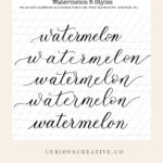
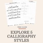
Here are five styles of the same word. In what I affectionately call “style study,” here are five attributes of style on this page. You can use these style variations to enhance, change, and vary how you use your brush pens for modern calligraphy

Entrance and exit strokes.
The entrance and exit strokes can change the look of the word. Notice the small differences in each of the styles below. That’s part of the beauty of using brush pens in modern calligraphy – pressure varies the line width.
Length, direction, and form all play a role.
The third and fifth entrance strokes are standard, but one is longer than the other. Notice the same thing for the first and fourth entrance strokes. They follow a similar shape but the length makes the fourth example a little more dramatic. I haven’t mentioned the second entrance stroke, but it’s my favorite of the five on this page.
You can do the same with the exit stroke. Notice the understated nature of the first and last styles. Contrast that with the flare in the middle three examples.
Finally, notice how in the second and last example there are complementary strokes. The entrance stroke and exit strokes complement each other. The first one I didn’t consider that at all. Notice the difference?
These are just a few things to consider when it comes to the entrance and exit strokes.
Bounce
You can quickly glance at the example photograph and see the use of bouncing in the middle three examples. The degree of bouncing varies. That’s the beauty of modern calligraphy. You can change up the styles.
While I would love to tell you I was intentional in increasing the amount of bounce in these examples, it simply turned out that way. The second only bounces the m and the n. In the third example, I bounced the letter at, t, m, and n. And the fourth I exaggerated the bounce. Again, you can see how the bouncing of letters can change the style.
Notice I didn’t change the form of the basic strokes and my other letters still sit on the baseline. Sometimes bouncing can become illegible when the baseline moves for all the letters…It can feel like riding a car on a dirt road with lots of potholes. That’s not a pleasant experience for your audience.
Stretch
Stretching a word is something that takes practice, practice, practice. Sorry if I sound like a broken record about practice, but it’s the foundation of all modern calligraphy. And, practicing modern calligraphy can be a great way to relax at the end of a long day.
In the second example, I stretched the letters. Ideally, the space between the letters will be the same when you are stretching. In my example, the letters ‘e and i’ crept a little too close to each other. I’d say the same thing for the o and the n.
Why am I pointing this out? Because it’s how we learn. Next time I stretch a word in modern calligraphy, I’ll pay more attention to the spacing. The reality is, here, I was thinking, “oh no, I’m at the end of the page?” Yes, it happens.
Spacing
This is a variation on stretching. Notice in the first and last examples the consistent spacing between the letters. This happens because I learned the basic strokes alongside hours of practice. It’s a more traditional form of calligraphy but is still modern calligraphy.
Flourishes
While I didn’t offer any flourishes at the end of the word or below the word watermelon, notice the crossbar on my letter t in all but the final word. There is a swoop and a swirl to each crossbar. Some are shorter than others.
The fourth example word has the most dramatic crossbar on the t. I did that intentionally to fill the visual space created when I bounced the letter a.
Style Study
I hope this little review of the word watermelon in five different styles, naming five style attributes was helpful in your modern calligraphy journey.
Let me know in the comments below: What attribute of style are you most excited to practice?
Supplies I Use
Rhodia Dot Grid Square 8 inch X 8 inch notebook – Orange cover
Rhodia Dot Grid Square 8 inch X 8 inch notebook – Black cover